
GEA WEB
DESIGN
SUMMARY
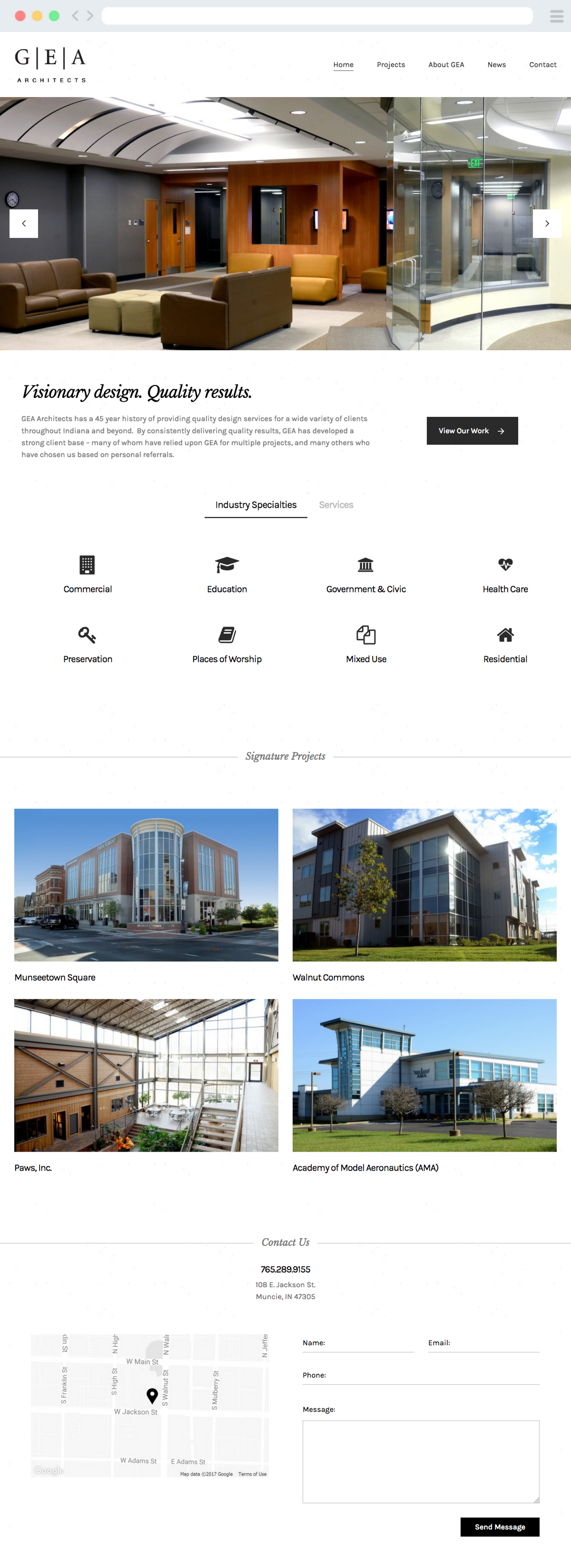
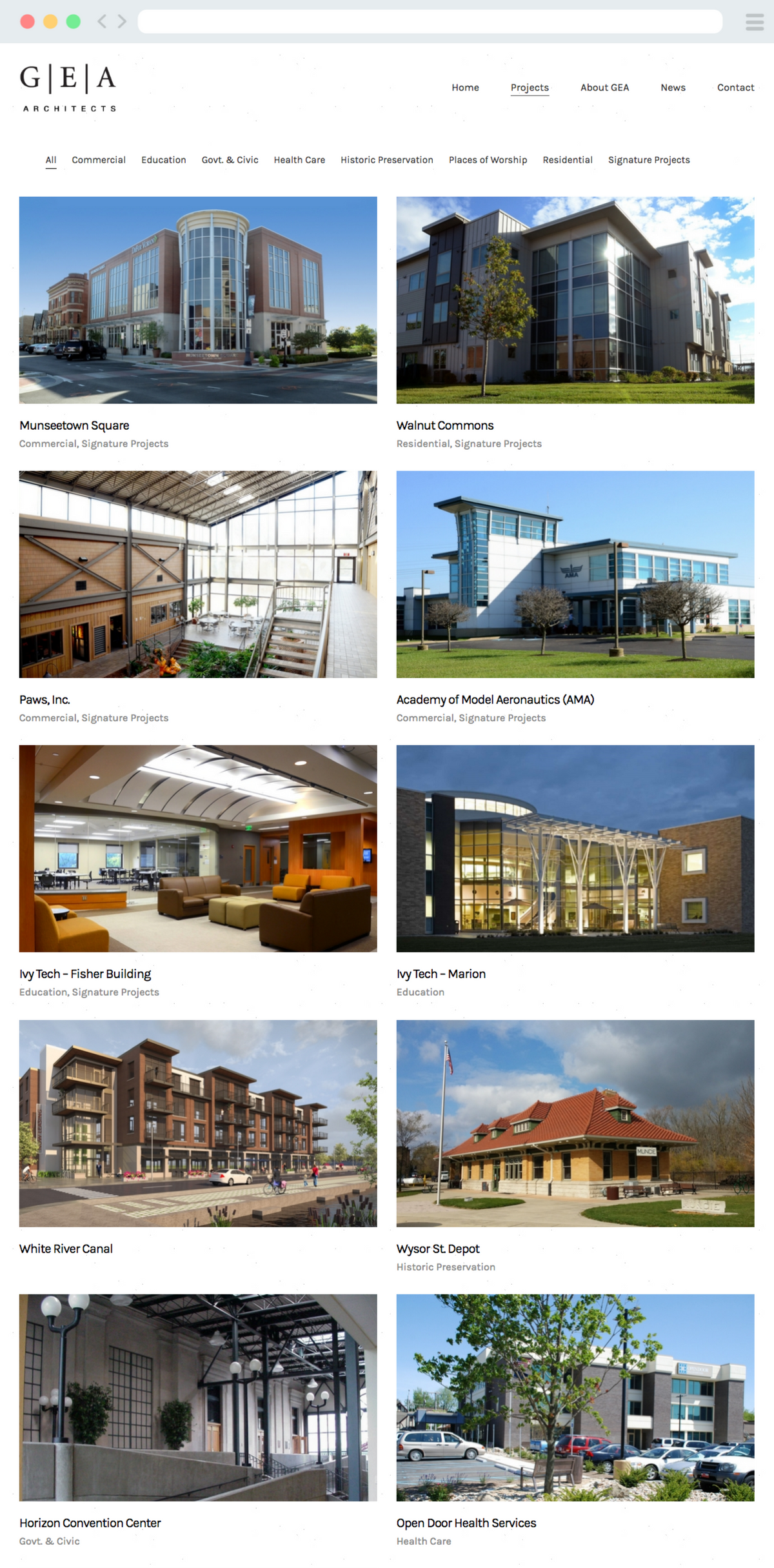
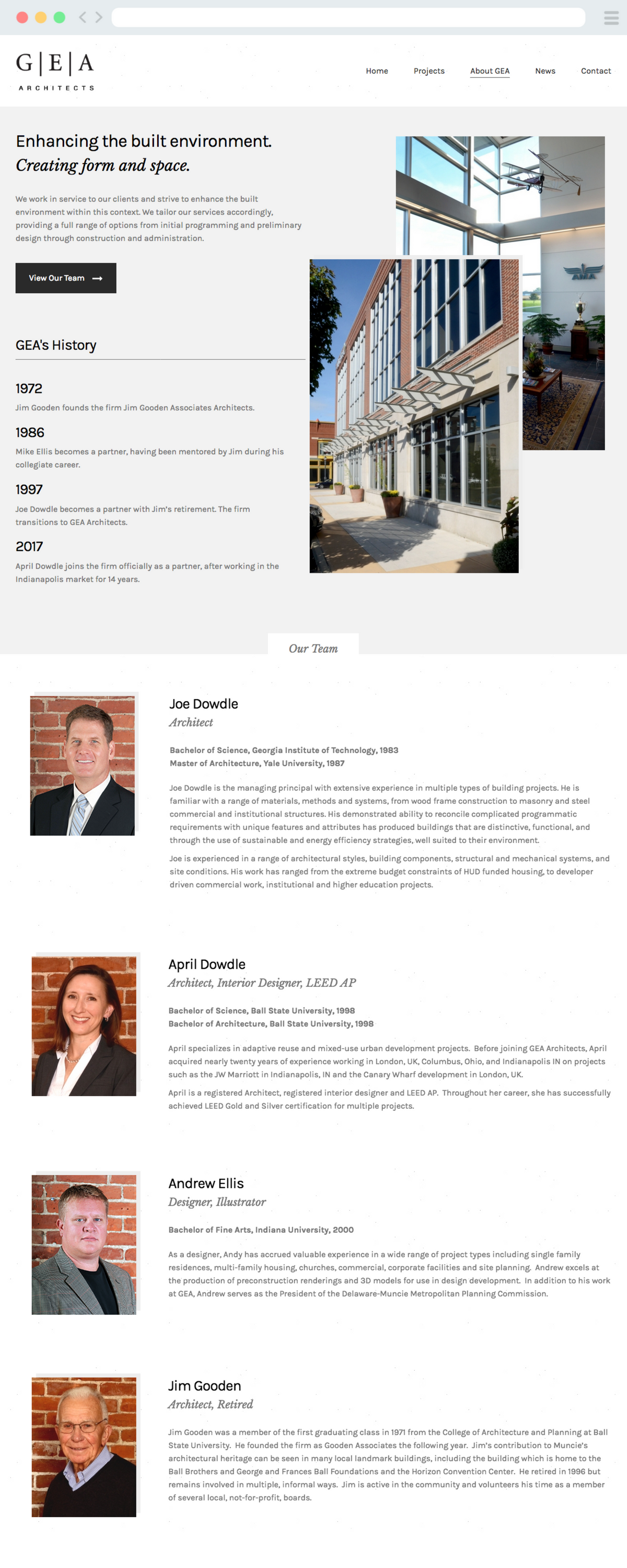
For an architecture firm which prides itself in making visual statements, its website was anything but. The mission was to rebuild GEA's online presence from the ground up, one that adhered to the tried and true design mantra: form follows function. Every component and interaction on the GEA website was designed to allow the visitor to review GEA’s philosophy and project examples quickly and friction free - from both desktop and mobile devices.


DES
IGN.
NOTHING SUPERFLOUS
GEA, above everything else, expressed desire for a minimal yet elegant site design with no superfluous elements. Everything from the color palette, icon sets, and typography was chosen because they were simple and didn’t draw attention away from the architectural photography. White space was used generously as well to achieve this look.
COLOR PALETTE
#000000
#FFFFFF
#F2F2F2
BODY COPY
MAIN HEADING
Karla Bold
ACCENT HEADING
Baskerville Italics
ICONS
BUTTONS

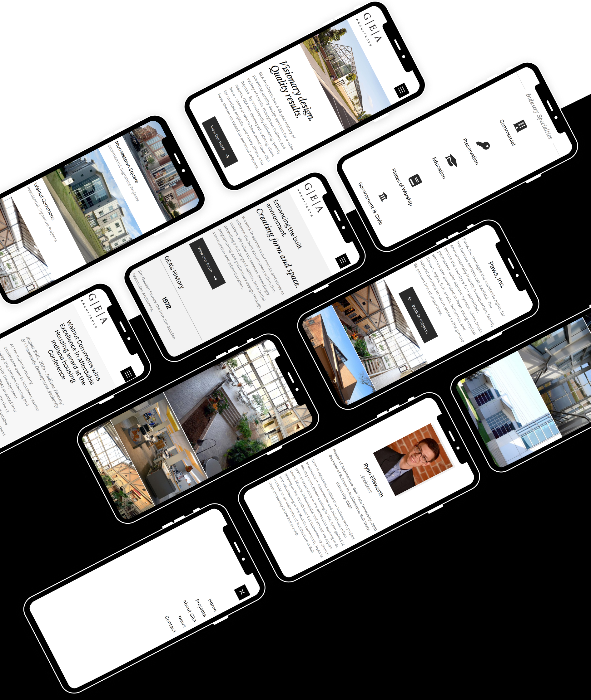
UX.
GALLERY EXPERIENCE
One of the most annoying aspects of a portfolio focused site is all the clicking one is required to do to open galleries, switch between photos, close galleries, etc. The gallery experience on the GEA website was crafted to be a simpler user experience utilizing a fixed sidebar and a vertically scrolling gallery – resulting in a friction-free, less user intensive interaction.
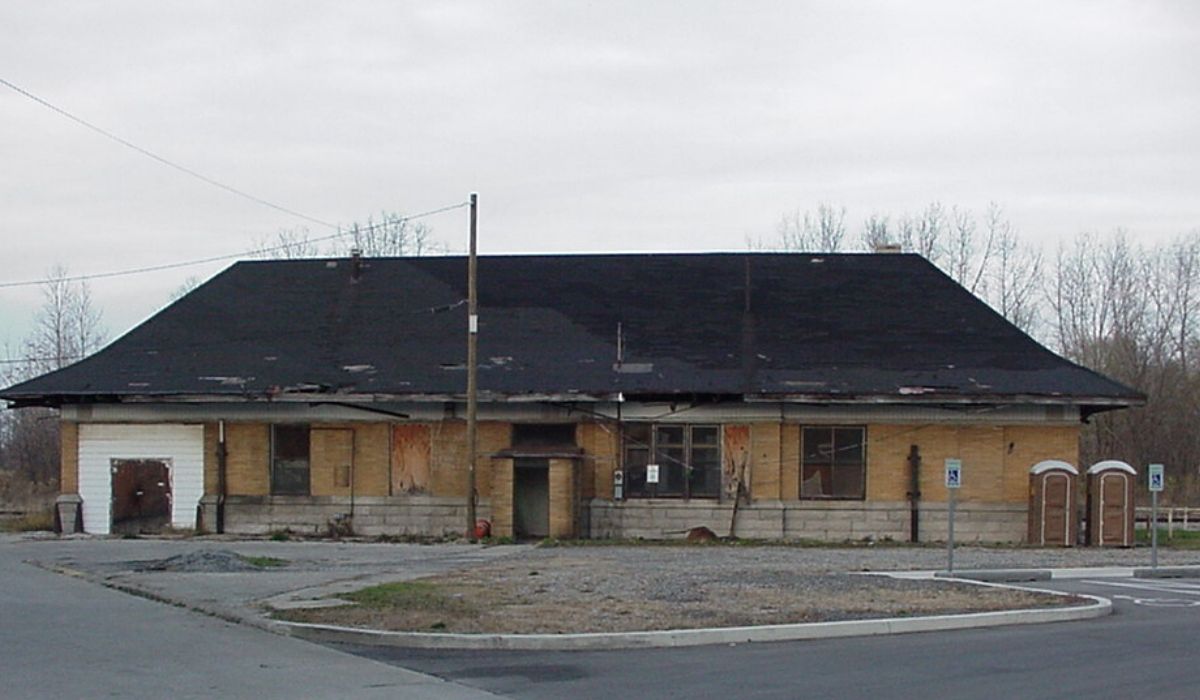
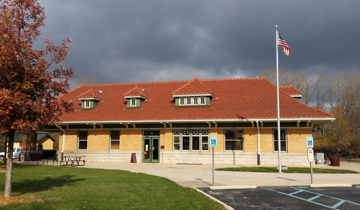
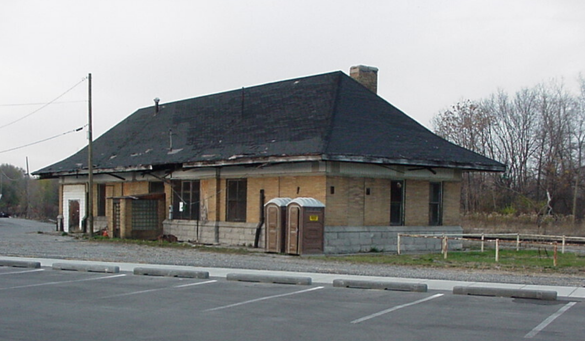
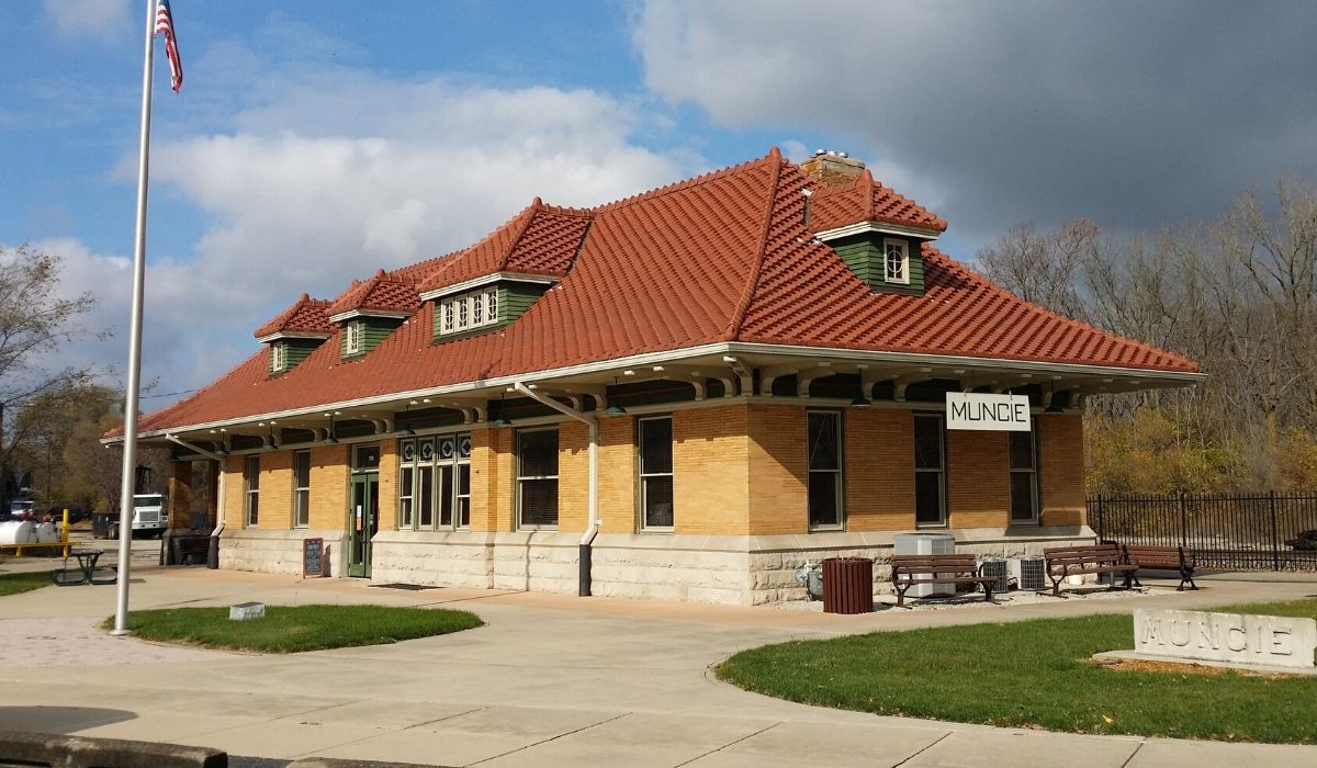
BEFORE & AFTERS
GEA had a few historical preservation projects that presented a unique opportunity to feature dramatic before and after project photography. Using photos taken from similar angles, I employed an image comparison interaction, allowing the user to vertically scroll between the before and after photos for a powerful results reveal.